MATLAB (Matrix Laboratory) is one of the most powerful tools for numerical computing, data analysis, and visualization. Plotting graphs is one of its core strengths, allowing engineers, scientists, and students to quickly visualize data, functions, and relationships.
Whether you're plotting a simple sine wave or creating complex multi-axis visualizations, MATLAB's plotting functions are intuitive yet highly customizable. In this comprehensive guide, we'll cover everything from basic plotting to advanced techniques.
Prerequisites
- MATLAB installed (R2018b or later recommended; MATLAB Online works too).
- Basic knowledge of MATLAB syntax (vectors, functions).
- Open the MATLAB Command Window or use the Live Editor for interactive scripting.
Basic Plotting in MATLAB
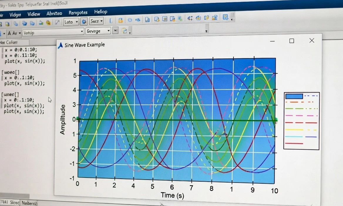
The primary function for 2D line plots is plot().
Example 1: Simple Sine Wave Plot
% Define data
x = linspace(0, 2*pi, 100); % 100 points from 0 to 2π
y = sin(x);
% Create the plot
figure; % Open a new figure window
plot(x, y);
% Add labels and title
xlabel('x (radians)');
ylabel('sin(x)');
title('Plot of the Sine Function');
grid on; % Add grid lines
This produces a clean sine wave curve.
x = linspace(0, 2*pi, 100);
y1 = sin(x);
y2 = cos(x);
plot(x, y1, x, y2);
xlabel('x');
ylabel('y');
title('Sine and Cosine Waves');
legend('sin(x)', 'cos(x)');
grid on;
You can also use different line specifications:
plot(x, y1, 'b-', x, y2, 'r--'); % Blue solid, Red dashed
Customizing Your Plots
MATLAB offers extensive customization options.
Line Styles, Colors, and Markers:
| Specification | Meaning | Example |
|---|---|---|
- |
Solid line | Default |
-- |
Dashed line | -- |
: |
Dotted line | : |
-o |
Solid with circles | -o |
r |
Red | r |
b |
Blue | b |
g |
Green | g |
Example with styling:
x = 0:pi/10:2*pi;
y = sin(x);
plot(x, y, '--gs', 'LineWidth', 2, 'MarkerSize', 10, ...
     'MarkerEdgeColor', 'b', 'MarkerFaceColor', [0.5 0.5 0.5]);
title('Styled Sine Wave');
Adding Annotations and Legends
- xlabel(), ylabel(), title()
- legend('Label1', 'Label2', 'Location', 'best')
- text(x, y, 'Annotation') for text on plot
- annotation('textbox', ...) for more control
Axis Limits and Ticks
xlim([0 10]); % Set x-axis limits
ylim([-2 2]); % Set y-axis limits
xticks(0:pi/2:2*pi);
xticklabels({'0', '\pi/2', '\pi', '3\pi/2', '2\pi'});
Subplots and Multiple Figures
Use subplot() to create multiple plots in one figure:
x = linspace(-2*pi, 2*pi, 200);
subplot(2,2,1); plot(x, sin(x)); title('Sine');
subplot(2,2,2); plot(x, cos(x)); title('Cosine');
subplot(2,2,3); plot(x, tan(x)); ylim([-5 5]); title('Tangent');
subplot(2,2,4); plot(x, x.^2); title('Quadratic');
For separate figures, use figure(2); etc.
Other Useful Plot Types
MATLAB supports many specialized plots:
- scatter(x,y) — Scatter plots
- bar(x,y) — Bar charts
- histogram(data) — Histograms
- stem(x,y) — Discrete data
- plot3(x,y,z) — 3D line plots
- surf(X,Y,Z) — Surface plots
- contour() — Contour plots
Advanced Techniques
- Hold On/Off: hold on; to overlay plots without clearing.
- Log Scales: semilogx(), semilogy(), loglog().
- Error Bars: errorbar(x, y, err).
- Object-Oriented Customization
p = plot(x, y);
p.LineWidth = 3;
p.Color = [0 0.4470 0.7410];
5. Exporting Plots:
saveas(gcf, 'myplot.png');           % PNG
exportgraphics(gcf, 'myplot.pdf', 'ContentType', 'vector'); % High-quality PDF
Best Practices for Professional Plots
- Always label axes and add a title.
- Use legends for multiple datasets.
- Choose appropriate line widths (1.5–2.5) and font sizes.
- Use consistent color schemes (MATLAB's default is good; consider colororder).
- Add grid lines sparingly.
- For publications, export as vector formats (PDF/EPS).
- Use tight_layout equivalent via axis tight or manual positioning.
Common Troubleshooting
- No plot appears: Check variable sizes match; use figure.
- Overlapping plots: Use hold off or new figure.
- Performance: For large datasets, downsample or use plot efficiently.
- Fonts and readability: Set set(gca, 'FontSize', 12).
Conclusion
Plotting in MATLAB is straightforward yet incredibly powerful. Start with basic plot() commands and gradually explore customization and specialized functions. Practice with real datasets to master data visualization.
Next Steps:
- Explore the MATLAB Plot Gallery.
- Try the Live Editor for interactive exploration.
- Experiment with App Designer for interactive plots.
Happy plotting! If you have specific data or plot requirements, share them in the comments.