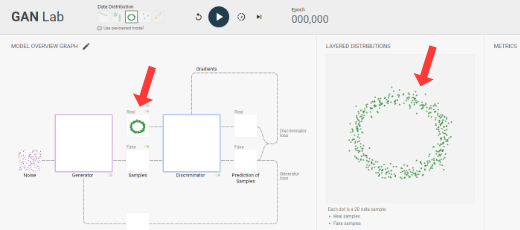
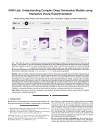
Model Overview Graph
Discriminator
loss
loss
Generator
loss
loss
Real
Fake
Prediction of
Samples
Samples
Discriminator
Generator
Gradients
Gradients
Real
Fake
Samples
Noise
1
Generator derives samples from noise
2
Discriminator classifies samples
3
Computes discriminator loss
4
Computes discriminator gradients
5
Updates discriminator based on gradients
1
Generator derives samples from noise
2
Discriminator classifies fake samples only
3
Computes generator loss
4
Computes generator gradients
5
Updates generator based on gradients
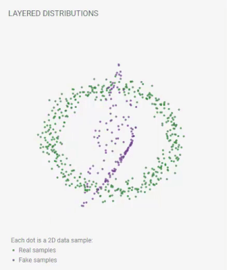
Layered Distributions
Each dot is a 2D data sample:
real samples;
fake samples.
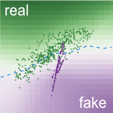
Background colors of grid cells represent
discriminator's classifications.
Samples in green regions are likely to be real; those in purple regions likely fake.
Samples in green regions are likely to be real; those in purple regions likely fake.
Manifold represents
generator's transformation results from noise space.
Opacity encodes density: darker purple means more samples in smaller area.
Opacity encodes density: darker purple means more samples in smaller area.
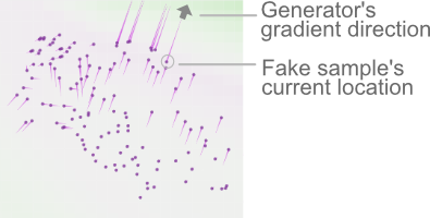
Pink lines from fake samples represent
gradients for generator.
This sample needs to move upper right to decrease generator's loss.
This sample needs to move upper right to decrease generator's loss.
Draw a distribution above, then click the apply button.
Metrics