plotResiduals(mdl3)
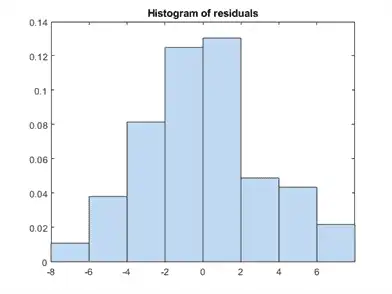
The new residuals plot looks fairly symmetric, without obvious problems. However, there might be some serial correlation among the residuals. Create a new plot to see if such an effect exists.
plotResiduals(mdl3,'lagged')
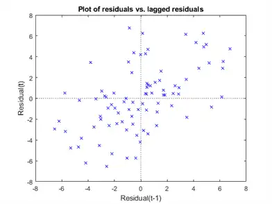
The scatter plot shows many more crosses in the upper-right and lower-left quadrants than in the other two quadrants, indicating positive serial correlation among the residuals.
Another potential issue is when residuals are large for large observations. See if the current model has this issue.
plotResiduals(mdl3,'fitted')
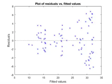
There is some tendency for larger fitted values to have larger residuals. Perhaps the model errors are proportional to the measured values.
Plots to Understand Predictor Effects
This example shows how to understand the effect each predictor has on a regression model using a variety of available plots.
Examine a slice plot of the responses. This displays the effect of each predictor separately.
plotSlice(mdl)
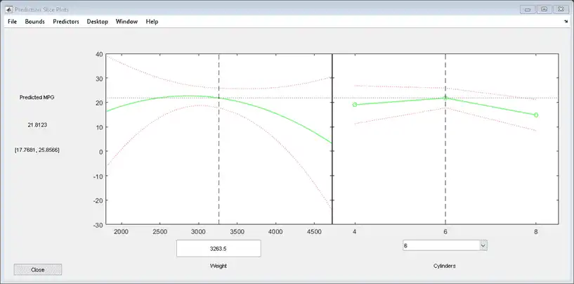
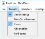
You can drag the individual predictor values, which are represented by dashed blue vertical lines. You can also choose between simultaneous and non-simultaneous confidence bounds, which are represented by dashed red curves.
Use an effects plot to show another view of the effect of predictors on the response.
plotEffects(mdl)

This plot shows that changing Weight from about 2500 to 4732 lowers MPG by about 30 (the location of the upper blue circle). It also shows that changing the number of cylinders from 8 to 4 raises MPG by about 10 (the lower blue circle). The horizontal blue lines represent confidence intervals for these predictions. The predictions come from averaging over one predictor as the other is changed. In cases such as this, where the two predictors are correlated, be careful when interpreting the results.
Instead of viewing the effect of averaging over a predictor as the other is changed, examine the joint interaction in an interaction plot.
plotInteraction(mdl,'Weight','Cylinders')
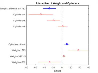
The interaction plot shows the effect of changing one predictor with the other held fixed. In this case, the plot is much more informative. It shows, for example, that lowering the number of cylinders in a relatively light car (Weight = 1795) leads to an increase in mileage, but lowering the number of cylinders in a relatively heavy car (Weight = 4732) leads to a decrease in mileage.
For an even more detailed look at the interactions, look at an interaction plot with predictions. This plot holds one predictor fixed while varying the other, and plots the effect as a curve. Look at the interactions for various fixed numbers of cylinders.